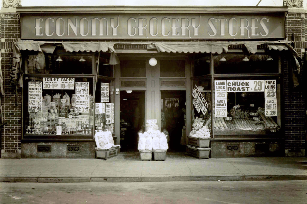
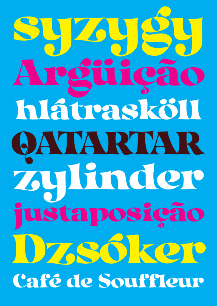
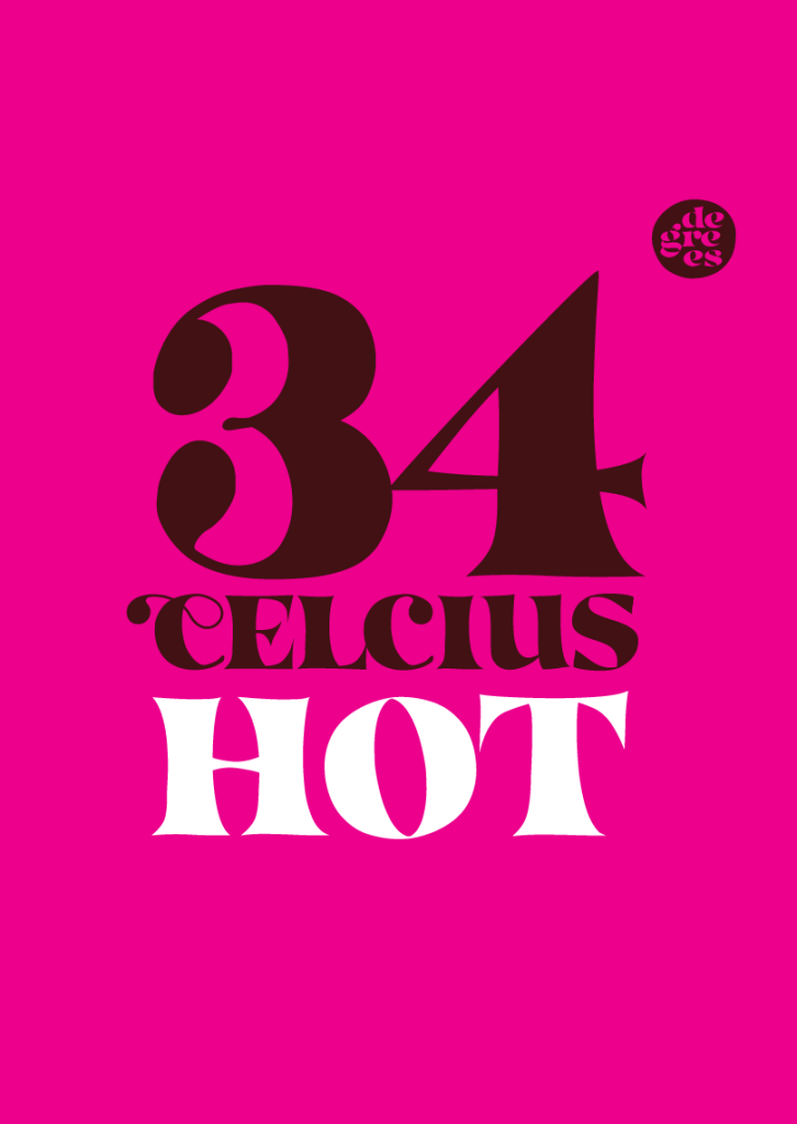
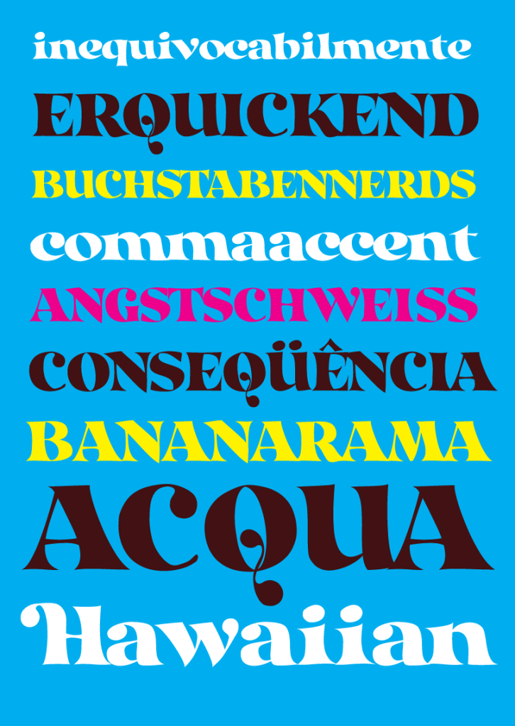
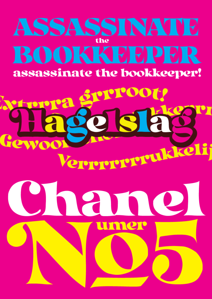
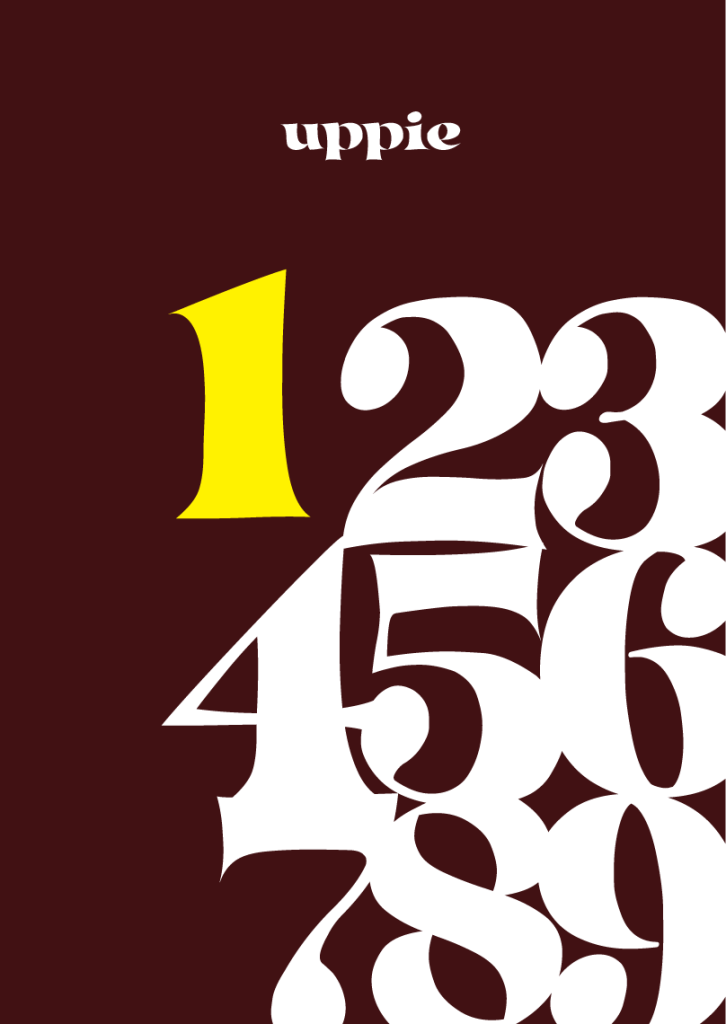
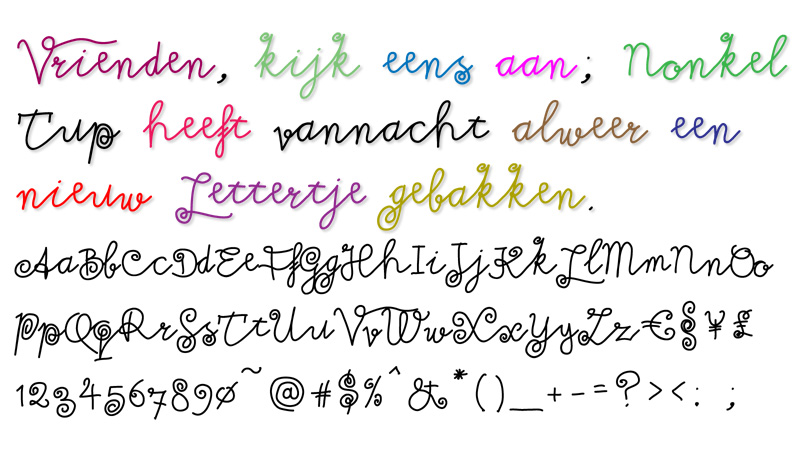
I make fonts for fun. They’re free, and open source. I used to make graffiti as a wee punk, but this is better: instead of seeing your tag where you sprayed it on a wall, you get to see your work used on a bag of chips or a poster or film titles et cetera. If you want serious type design, that’s not what I do: look up my talented class mates from art school, Fred Smeijers and Martin Majoor instead. And say hi from me.
I’m working my way up on this page so the top ones are the new ones. If that confuses you, just start at the bottom of the page.
All my fonts are free, free for commercial use and also free to distribute, so they get offered on many sites. Because of that I’ve only linked to the two sites I use to upload my fonts to; Dafont and FontSpace. My fonts have been downloaded about 5 million times on these two sites alone, but it’s a bit weird bragging about numbers when you’re handing out free stuff. It just proves many people have a lot of crap in their fonts folder. Me included!
Moogalator

I’ve always liked these embossed 3d designs for movie titles and such. So I made my own, and it was harder than I thought it would be, especially getting the shading inside the letter shapes to work. I’m not entirely pleased with the result, but it’s kind of okay. There’s a separate ‘filler’ font which has the same bearings and kerning, just to make it easy to add some color to your design.
Available at Fontspace for now, and I’m sure Dafont will follow soon.
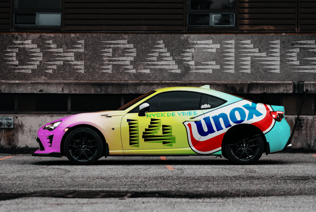
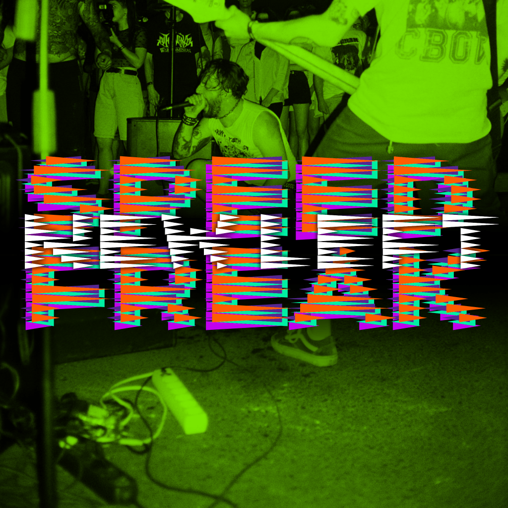
Speed Freak
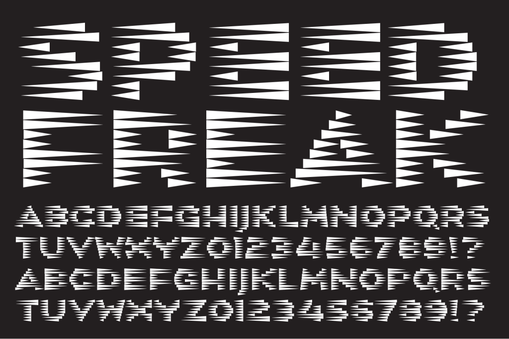
A quick and dirty design of a simple font idea. I based this small display font on my ‘Minne Petat’ font and finished it in a single evening. Made the mockups a while ago, I kind of like how it works, especially when you overlap the italic and regular versions.
As always, it’s free and comes with a SIL Open font license, so try it out.
On Dafont and Fontspace, as per usual.

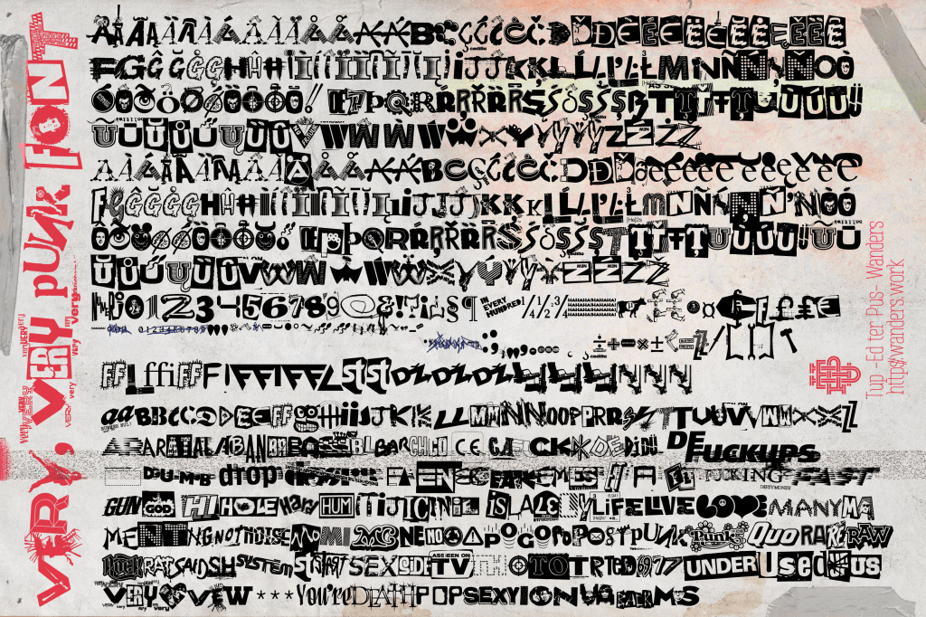
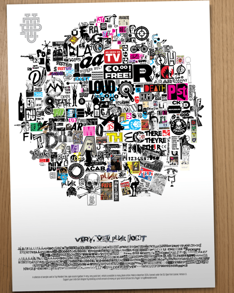
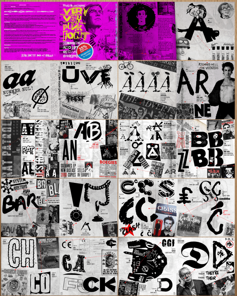
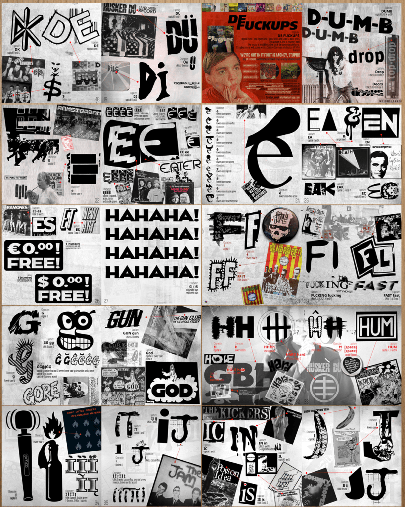
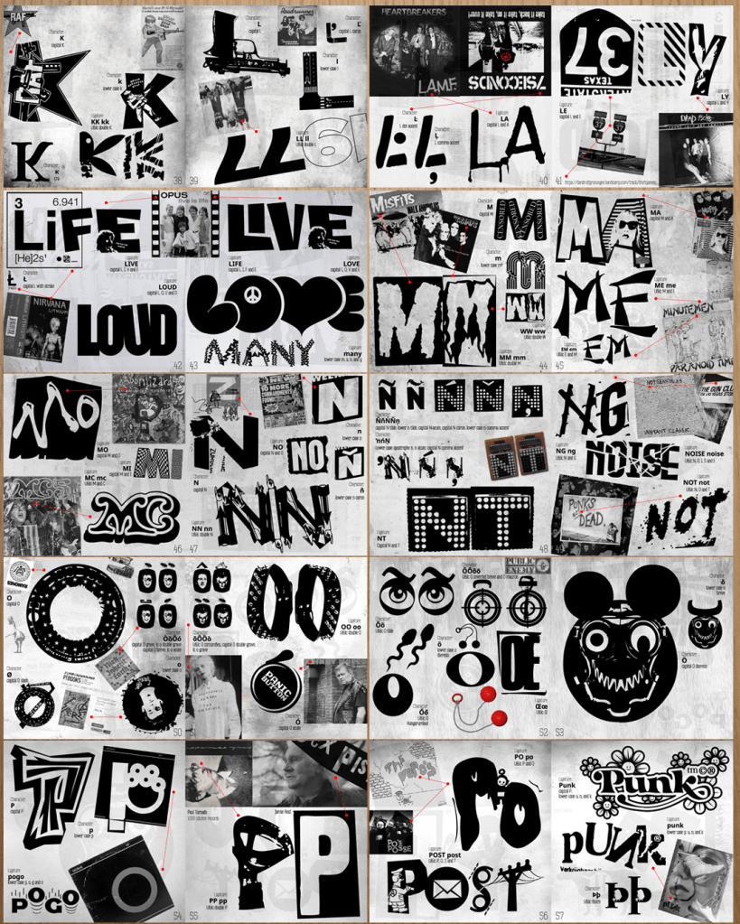
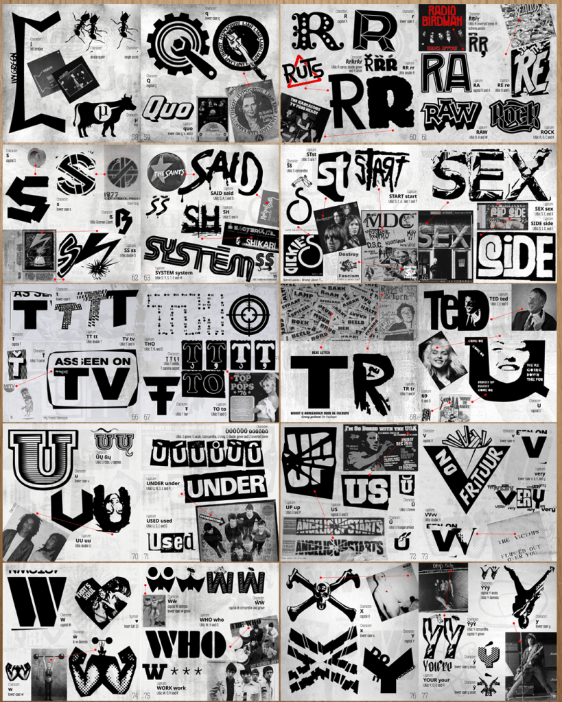
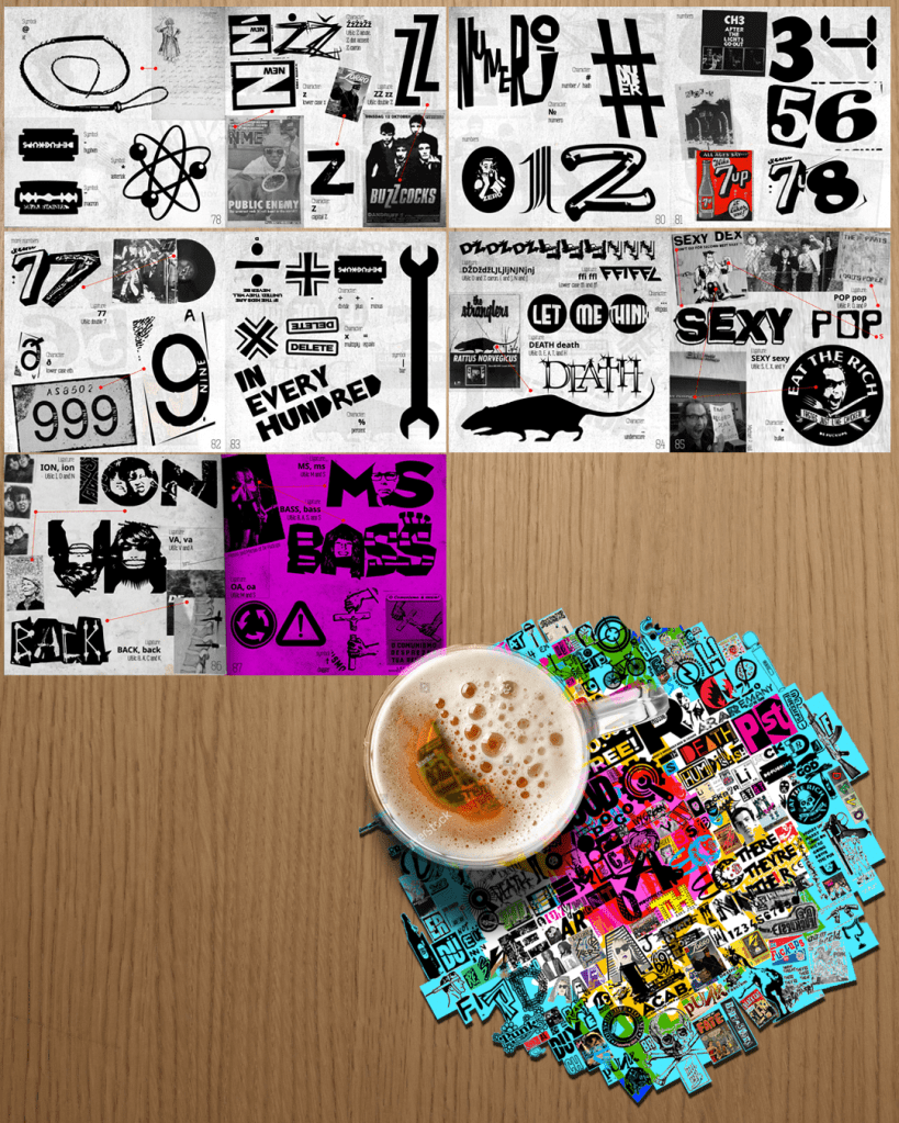
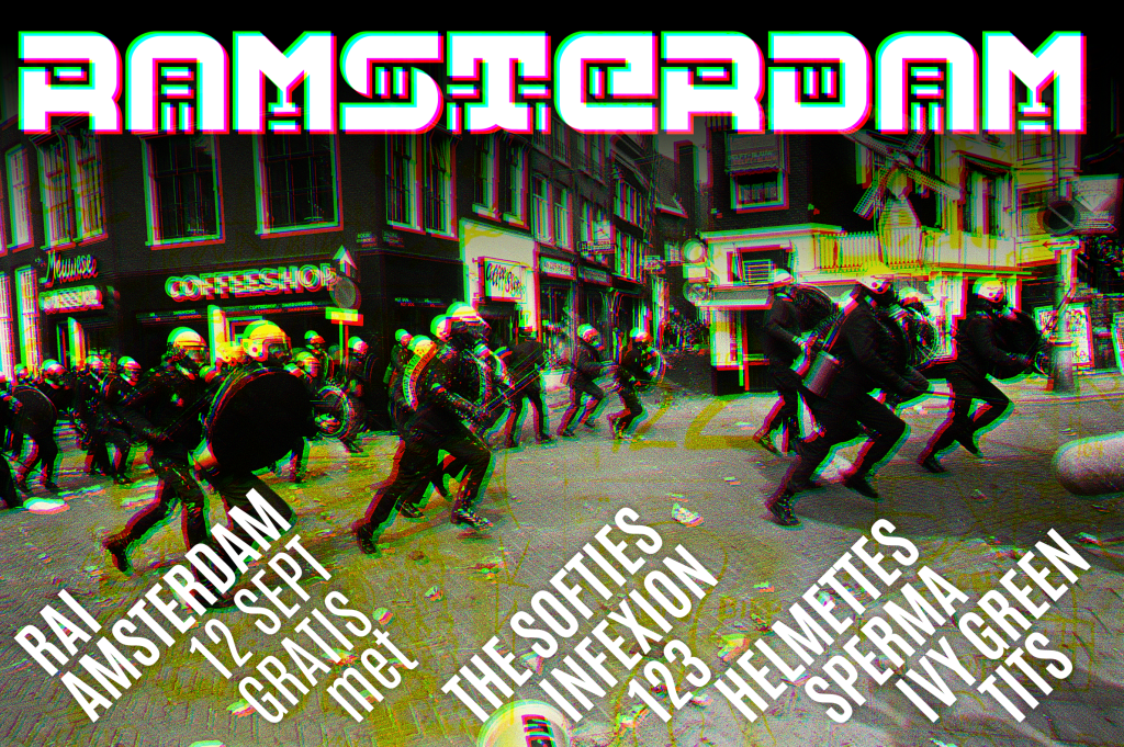
Very, very punk font

Well, this one was a fun project. It was more of an art work than a typeface, and I spent way too much time on it. I took all the punk influences I got from the mid seventies and cut them up into this collage of a typeface. It comes with a booklet that explains where all the samples come from, and I did a lot of scripting to make sure using the font would be a roller coaster ride. I hope you enjoy!
You can see the booklet and download the font at FontSpace.
The font itself is a lso available at DaFont
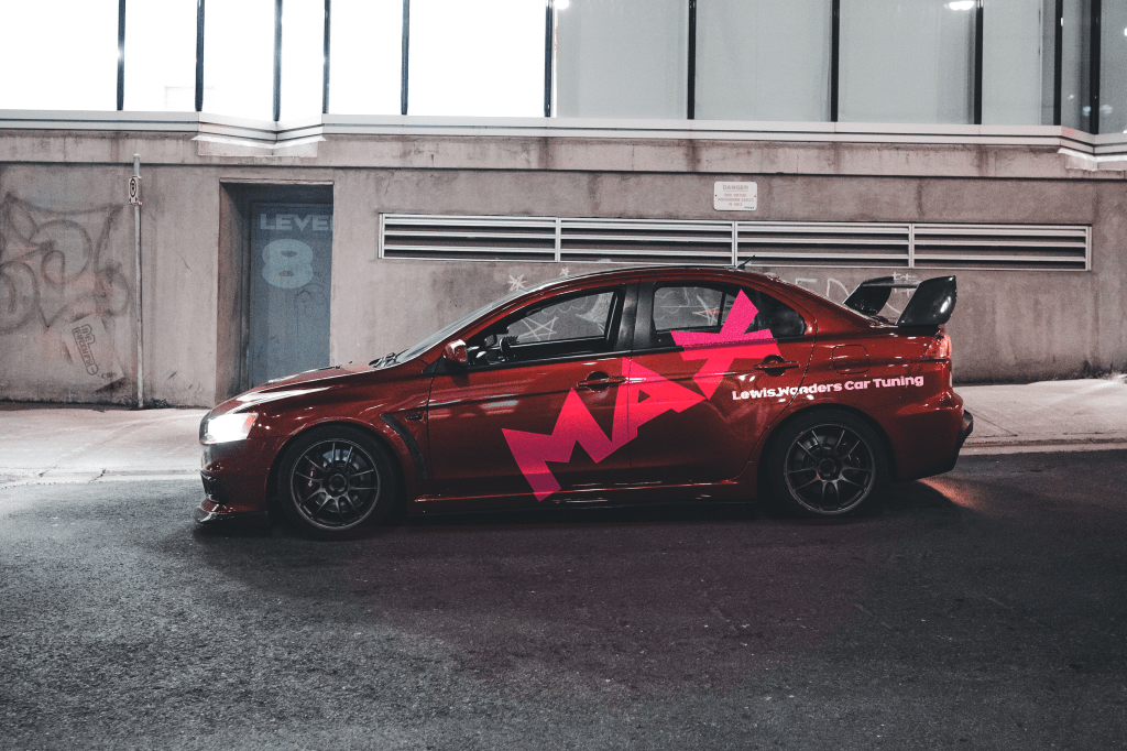
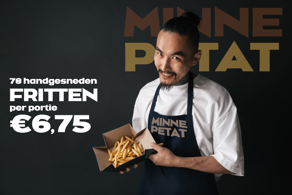
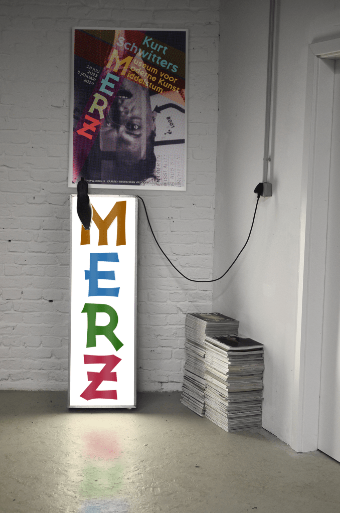
Minne Petat
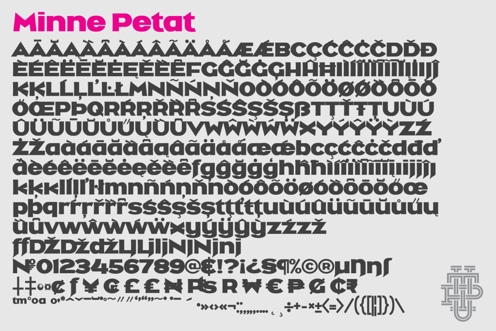
I needed a BIG FAT letter to make a vertical sign. Made my own as usual and so I share it for free as usual. Huge and fat with agressive pointy bits, you don’t want this font to be your enemy. ‘Minne Petat’ is dialect for shithead in the east of the Netherlands by the way.
Again, forgot to upload to Dafont, so it’s only available at Fontspace. Free and rights free as always!

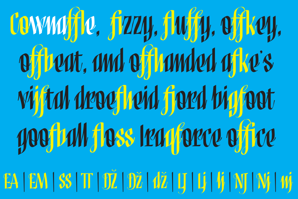
Cownaffle
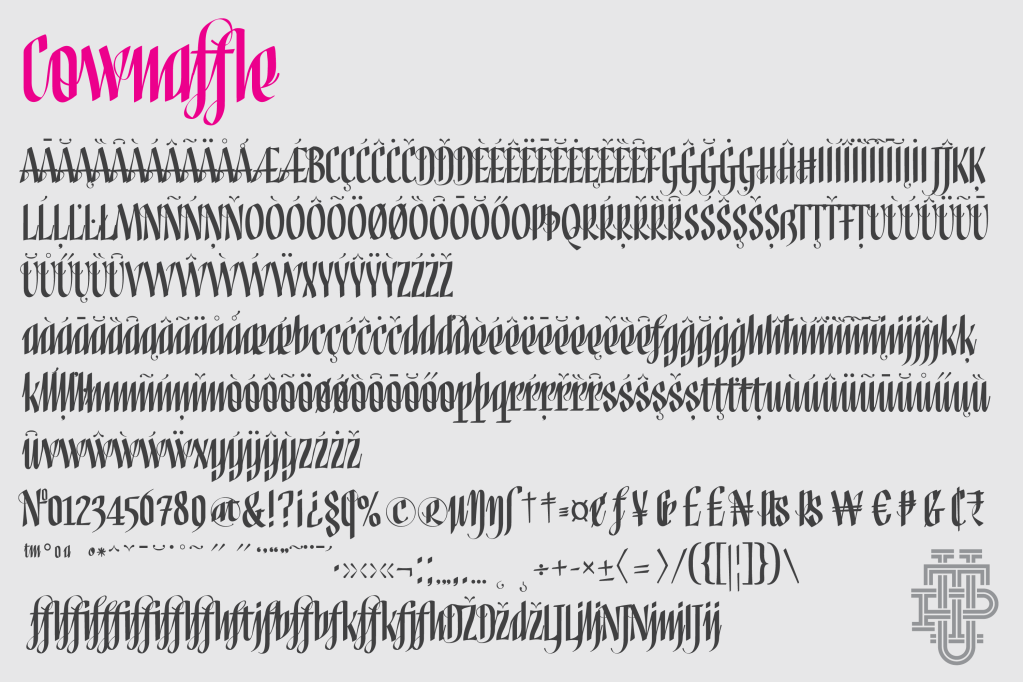
As much as I hate the fascist asshole, this one started when I saw the orange baboon write his signature. It was all parallel vertical lines, and I kind of liked that. So I made this font that does the same thing, but without the buffoonery. I think it looks quite classy to be honest. I like the thin connectors. It has a ton of ligatures, which were fun to make.
Available for free at Fontspace and oh damn, forgot to upload it to Dafont.
Greenwashing Machine
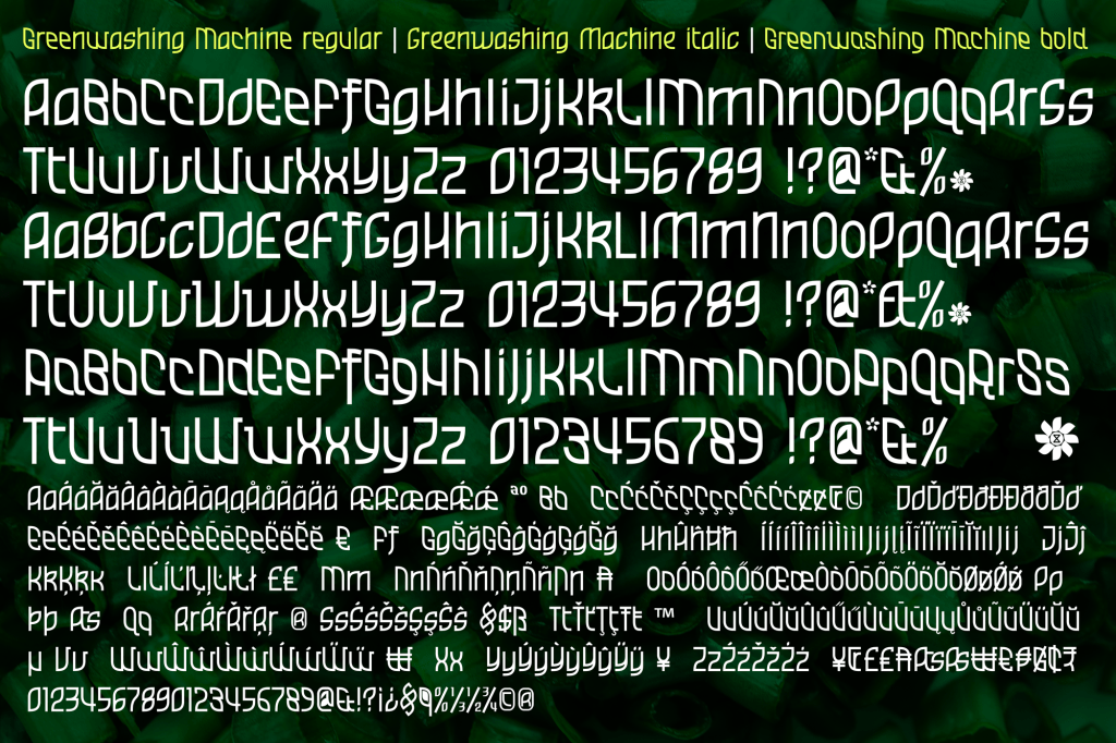
I made a word mark for a (new age hippy) “center for personal development and growth“, using the shape of a water droplet they had in their logo. I tried to make an entire font that was similar, with a leaf shape instead of a water drop.
I started with the regular, which turned out very irregular, and decided to make two more versions; one leaning to the left and one leaning to the right. (I named them bold and italic, because naming them left and right, Illustrator wouldn’t see them as being of the same font family)
I’m not a big fan of that macrochaotic organic hippy style, but I decided to publish it anyway, there’s always a couple of people out there who can make good use of it, whether it’s oil companies trying to greenwash their filth, or Extinction Rebellion fighting them. I’m supporting the latter btw.
Available for free at Fontspace and Dafont.

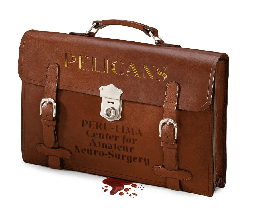
Boa Construktor

I saw a rear wing of an F2 car with the logo of Stokker on Formula 1 TV, and I liked the way it looked; huge, square and very bold. I looked up that logo on their website, but I thought it was a bit clumsy and clunky. So I decided to make a similar font, but better 🙂
I did not make a lower case because fonts like these are supposed to be used in ALL CAPS anyway. The lower case does have some variations of the caps though.
Available for free at Fontspace and I just noticed I never offered this one to DaFont. Ha!
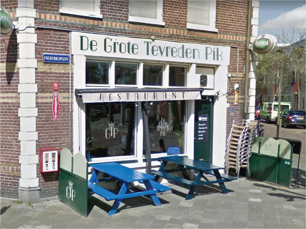
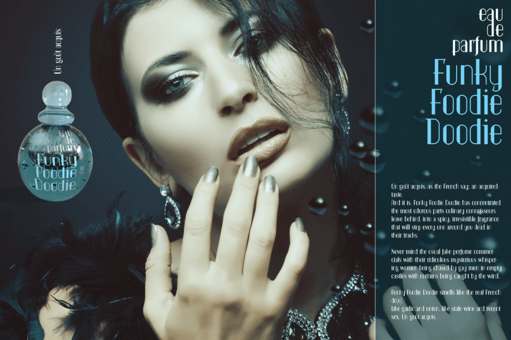
Funky Foodie Doodie
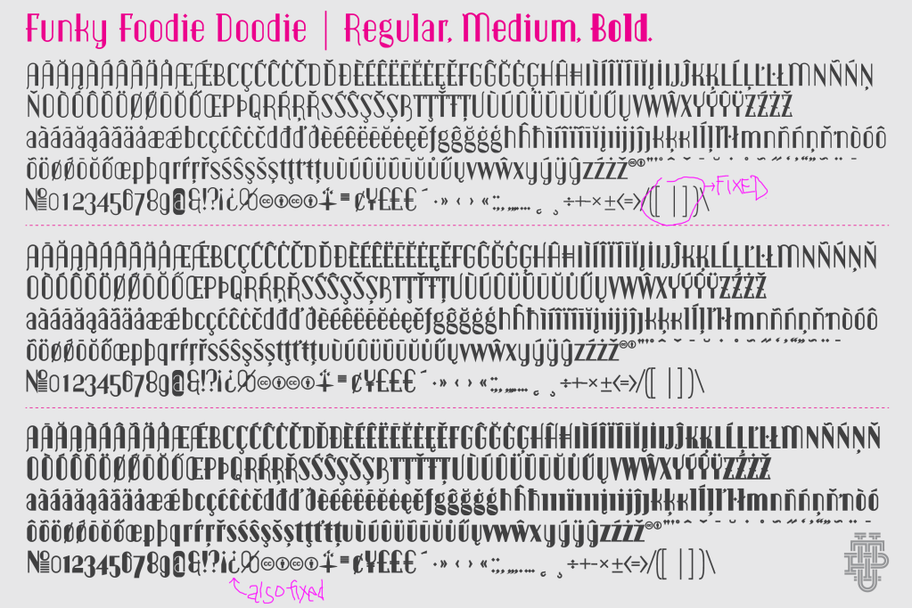
I’m not a big fan, but a lot of people in the food business, as well as all my exes like this kind of Art Deco stuff, and I like making a pastiche of that 30’s style, so I hope they’re all happy now.
One of my exes had a restaurant called de Grote Frederik, we’d pick up the phone with ‘de Grote Tevreden Pik’ (The Big Satisfied Dick) and no one ever noticed haha.
Available for free at Fontspace and Dafont.
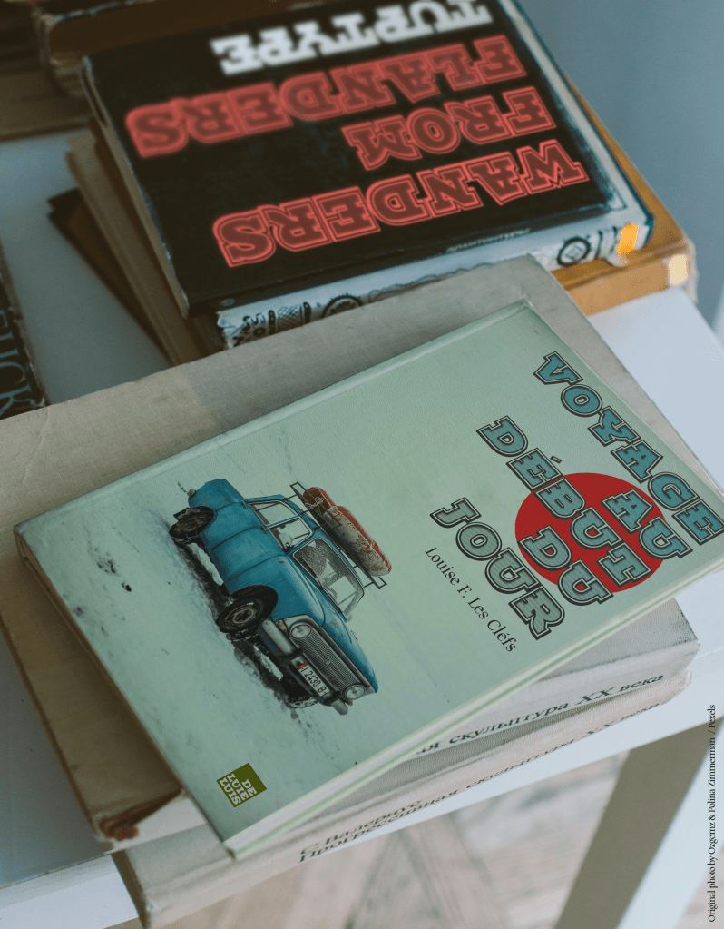
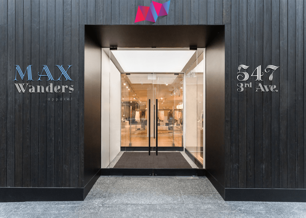
Wanders
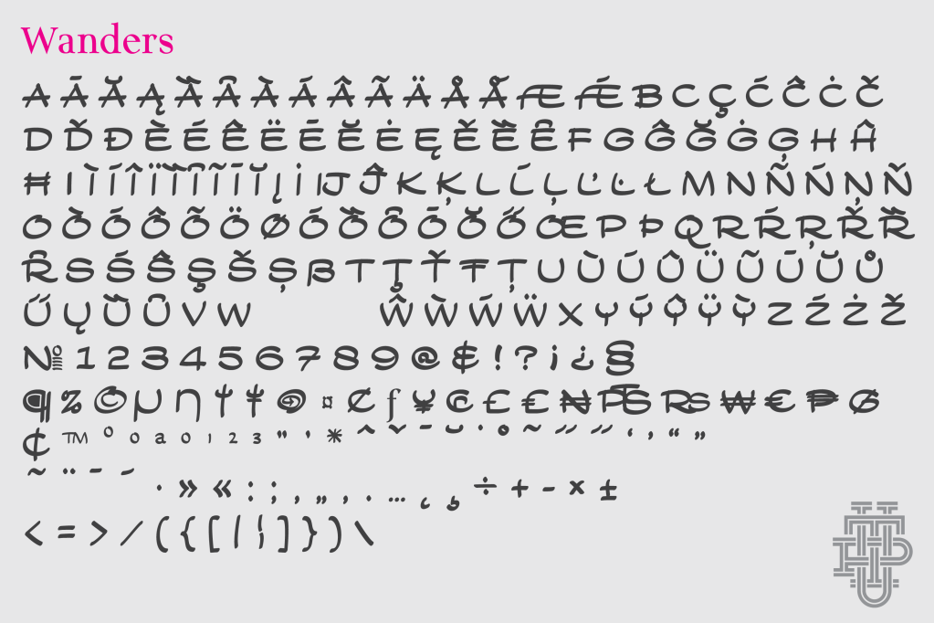
This was my late father’s handwriting, which I copied when I was in my teens. His version had more curls, a bit like Walt Disney’s. I kind of cleaned it up. I used our surname as the name of the font because it’s both our handwriting combined into one.
Here’s hoping that people will use this font instead of my early font Snickles, which I’ve grown to hate.
Available for free at Fontspace and Dafont.
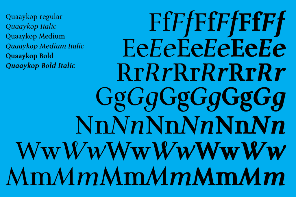
Quaaykop
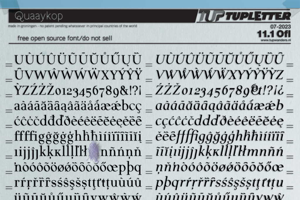
I made a couple of simple basic fonts to base my other fonts on. I still needed a simple boring serif font, but could never bring up the energy to actually make one, because it’s… well, boring. During a heatwave my fat ass had to stay inside. So I finally made that boring font from memory, trying hard to remember what I was taught during typography lessons in art school, forty years ago. I tried to keep it as boring as humanly possible, but I’m afraid I went frolicking on the beach of insanity here and there, you’ll see where when you see it 🙂
Quaaykop. Regular, Medium, Bold and Italic. My third font of that month. It’s not perfect, but it’ll do. Might as well share it. Ooh that 3 is ugly. Sorry.
Available for free at Fontspace and Dafont.
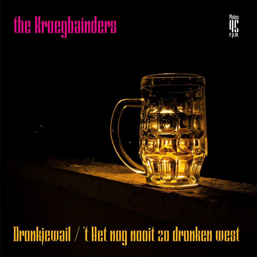
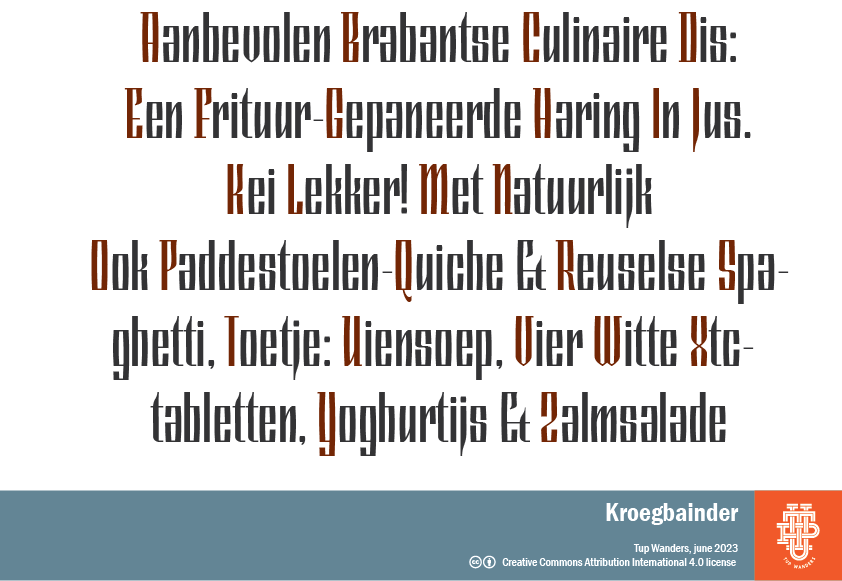
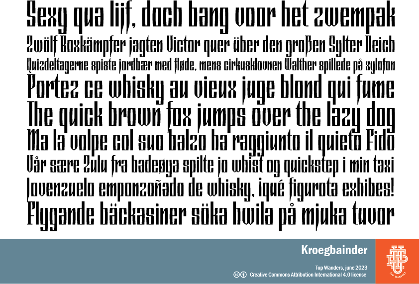
Kroegbainder

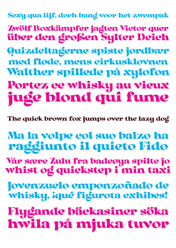
Back in the early 70s I had these cheap radios and tape recorders , some of them made in the old DDR. They had equally cheap logos on them -that I loved-, and I tried to make a font that looks like that. At the time I designed it, I somehow got in touch with people from Iceland complaining about fonts not supporting their language, so I made sure it did. From then on I added extended language support for most of my newer fonts. It’s a pain in the ass and a lot of extra work, but hey. We need to keep the Icelandic people happy, they’re the only ones who are not afraid to jail their bankers.
Available for free at Fontspace and Dafont.
Hexenkötel
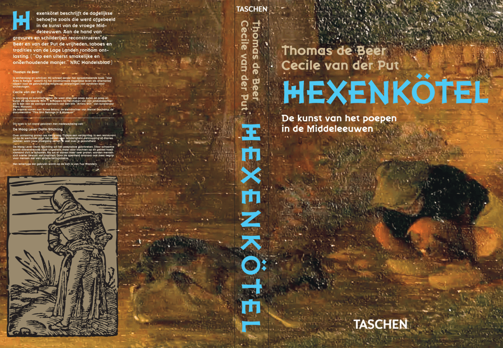
Another one I made for game developers in the first place. It has a fantasy/ fairy tale feel as well as some of aesthetics of the early 1900’s, I think it’s pretty gnarly. Hexenkötel means witches’ poo in my language btw.
Available for free at Fontspace and Dafont.
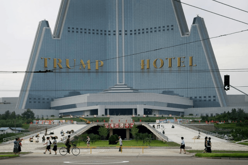
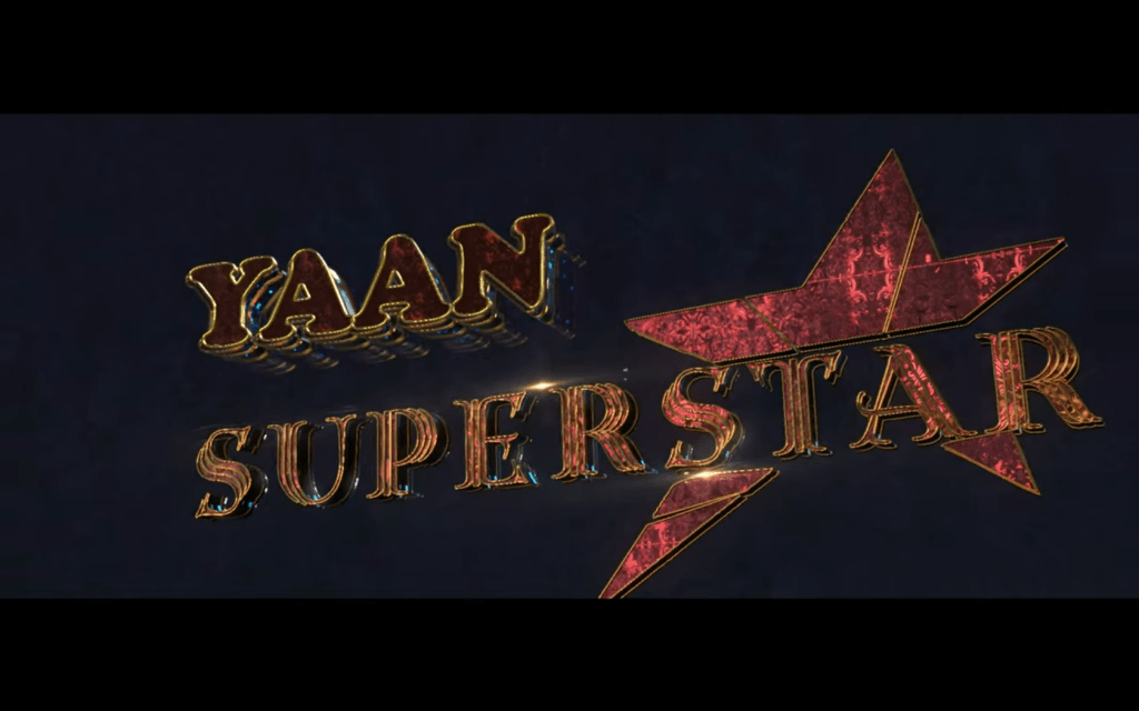
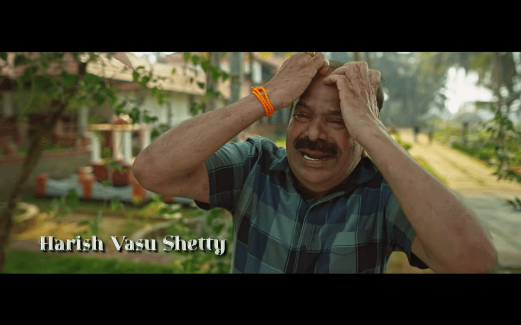
Fanfarrón
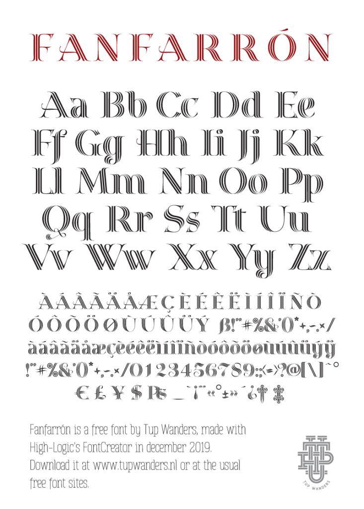
A luxurious. stylish font for a pompous and pretentious impression. I made it so typing all-caps will add extra spacing, for an even more dignified look. I started out drawing the S many times on paper, making it into a font seemed like a lot of work, so I procrastinated as long as humanly possible. Someone pointed out the 5 has the hairdo of Trump. And it’s in the titles of a Bollywood movie! I love stuff like that.
Available for free at Fontspace only, I’ve resubmitted it at Dafont.
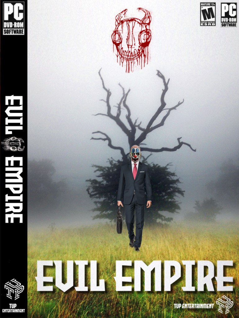
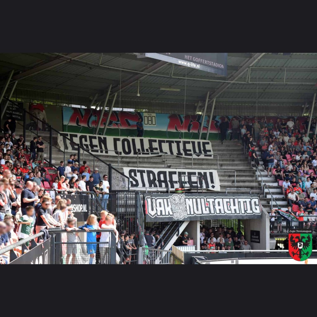
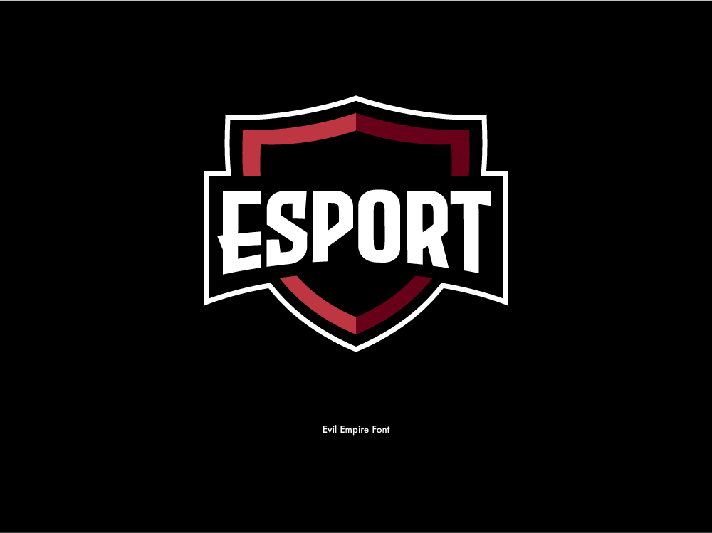
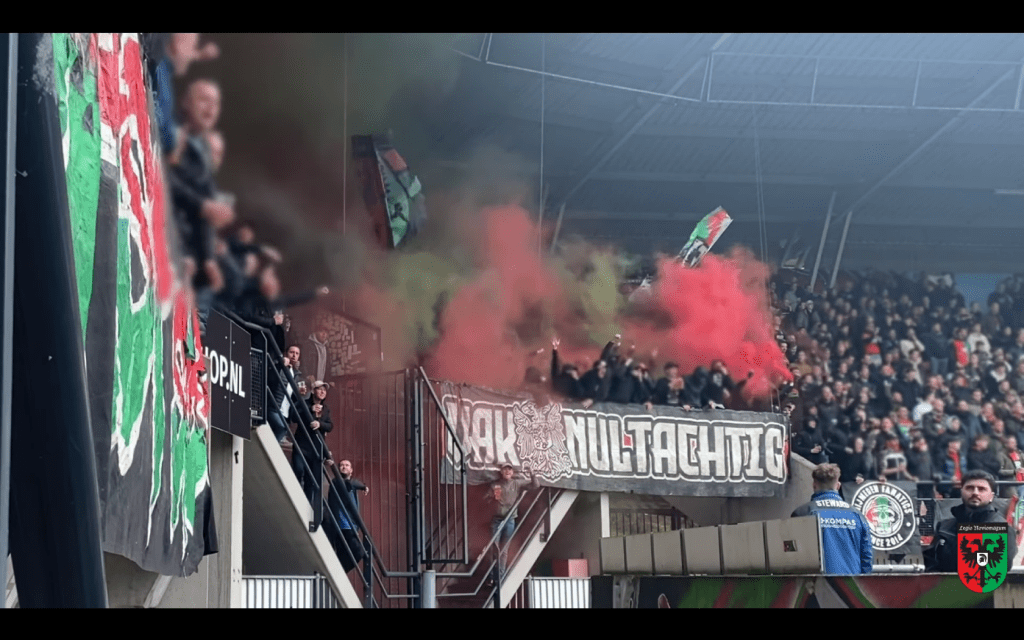
Evil Empire
I started out with the R, which had an evil 30’s look. Then I finished the rest of it in one night and made some mock ups the day after. It’s quite popular with game developers. I saw it used on a huge banner for a football match the other day. That W should be on trial for war crimes.
Available for free at Fontspace and Dafont.
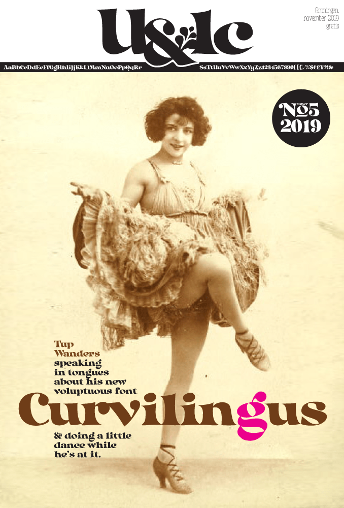
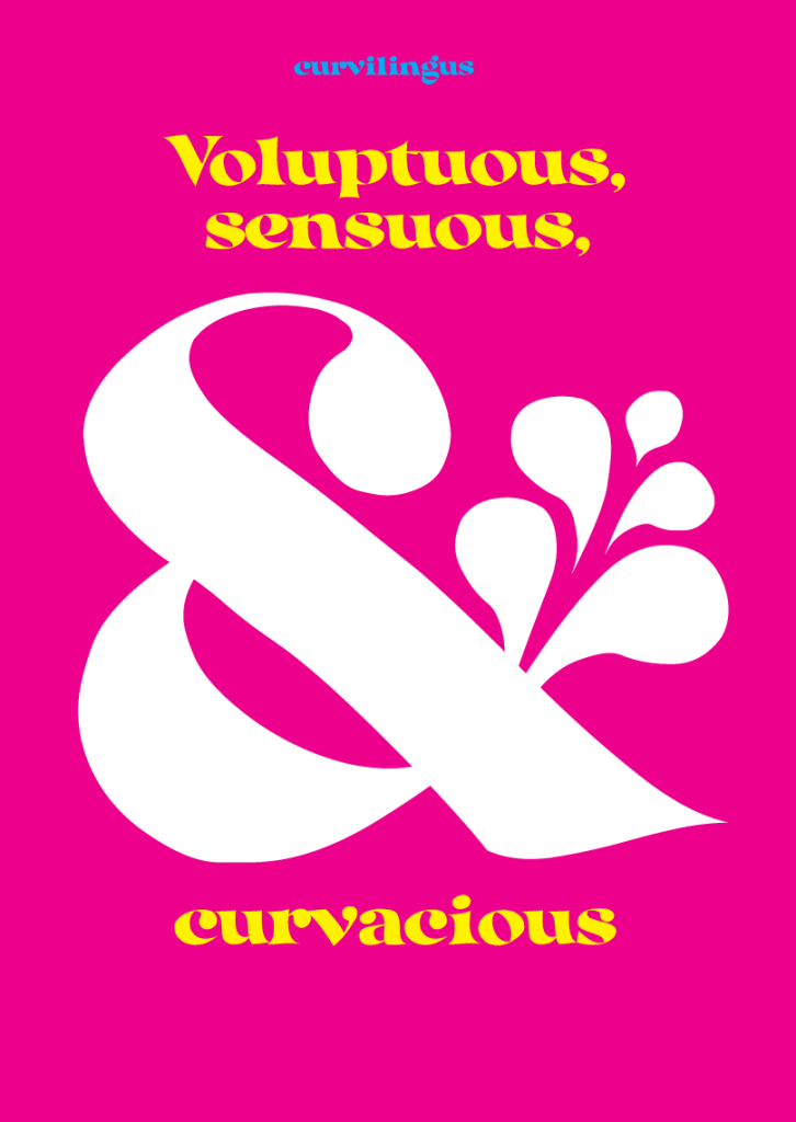
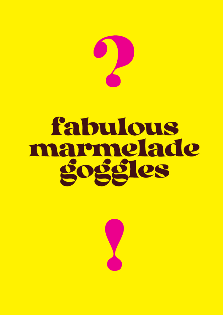
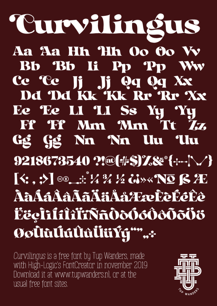
Curvilingus
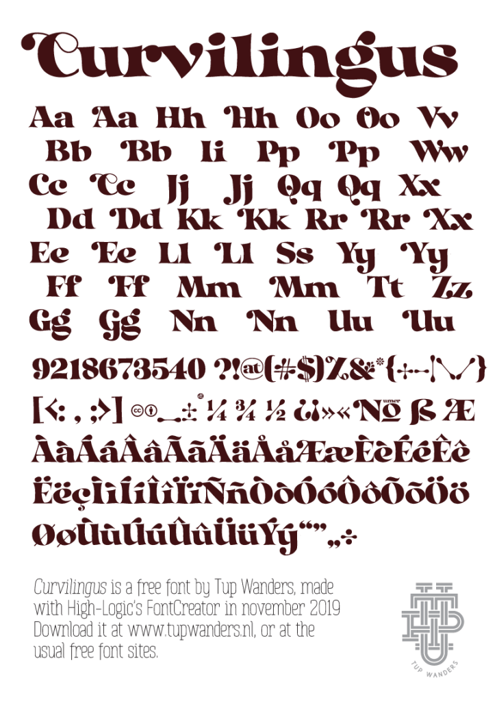
I like this one. It’s a font based on the letters I usually doodle on paper. Imperfect, all over the place, but fun, voluptuous, curvacious and sexy! Or as someone on social media put it: ‘It has love handles!’
(Also: the caps have extra swashes in the otf options)
Available for free at Fontspace and Dafont.
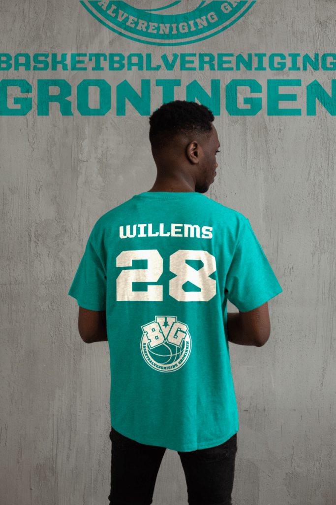
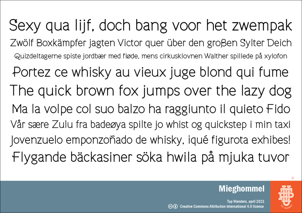
Mieghommel
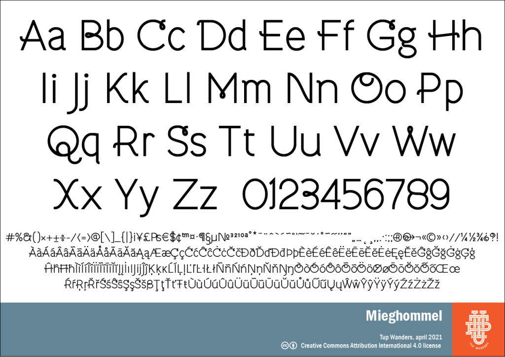
A quick and dirty simple sans variation of my base font that has grown some pig’s tails here and there. I don’t recommend using ALL CAPS, because it’s ugly. (Mieghommel is the word for ant in my home town Groningen.)
Available for free at Fontspace and Dafont.
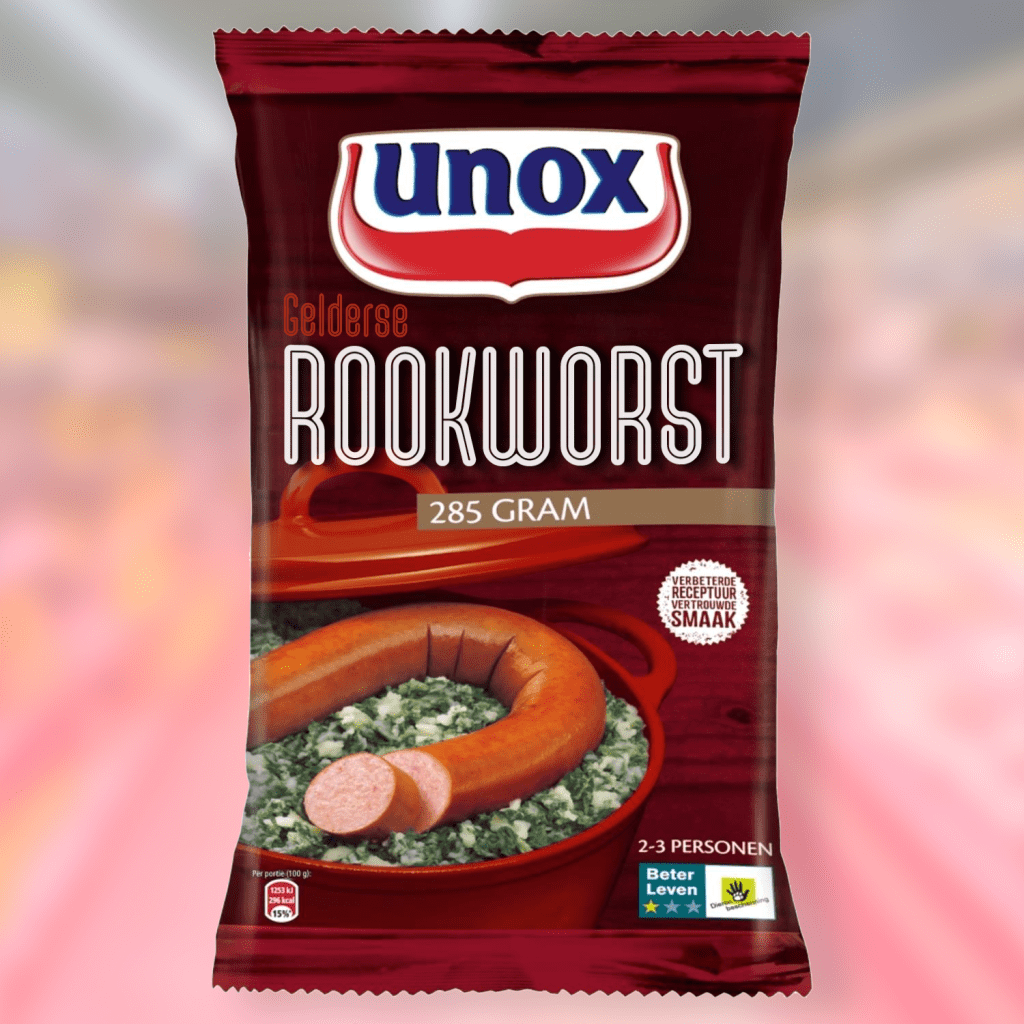
Rookworst
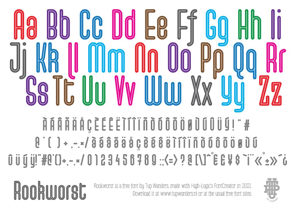
I was playing a mind numbing game that let you draw streets in a grid. I liked the aesthetics and made a font that followed the same rules. It looked like sausages so I named it after sausages, because.
Available for free at Fontspace and Dafont.
Kwark
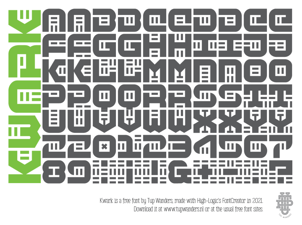
Just a silly science fiction font I made. I’ve never seen it in use and probably never will. Oh well.
Available for free at Fontspace and Dafont.
Slabyanuz
Just an experiment; HUGE negative space font with thicc slabs. I made it so it connects at the top and bottom -in Illustrator at least- which makes some nice strange shapes when you use multiple lines. Because of this it oversteps the usual boundaries (windescent and winascent), which can give you some trouble printing, so convert to curves before you do.
You can use a / or a \ as a black space between words. Clumsy, I know!
Available for free at Fontspace and Dafont.
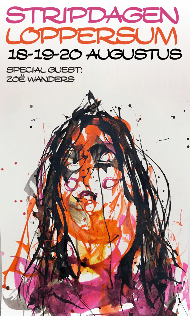
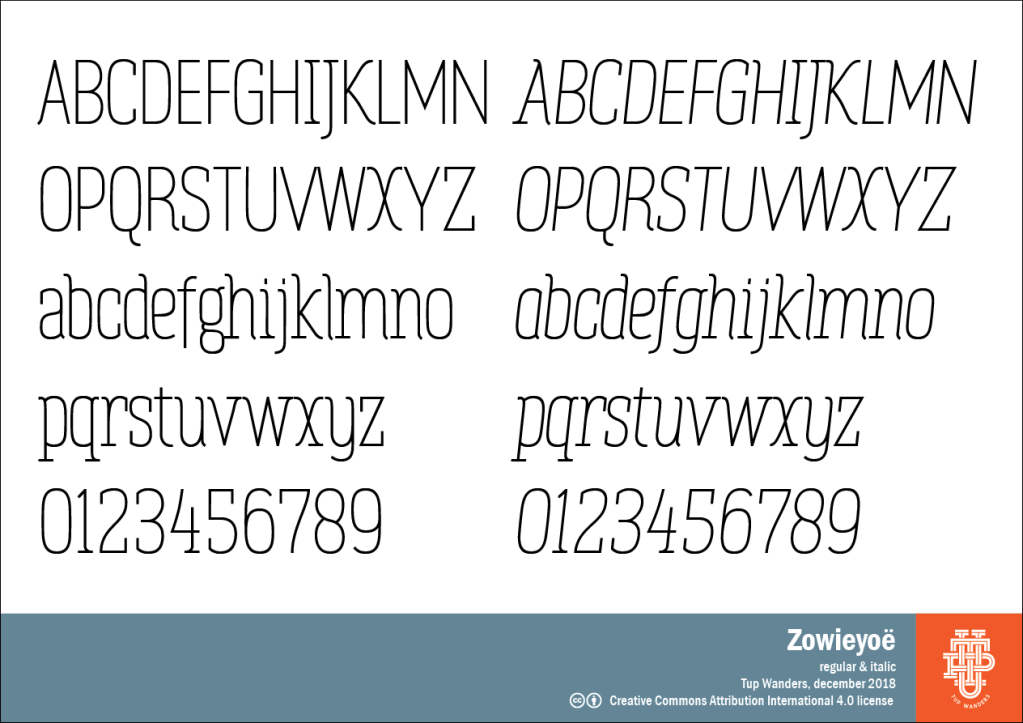
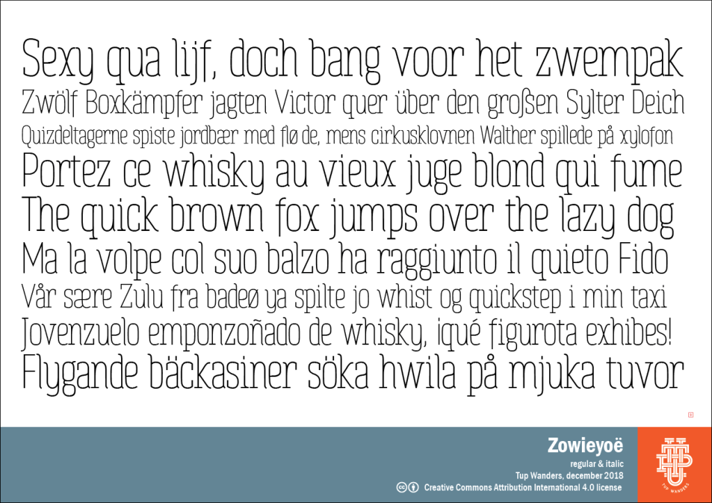
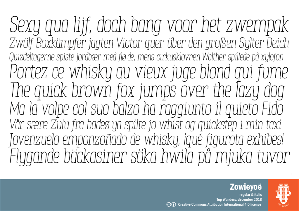
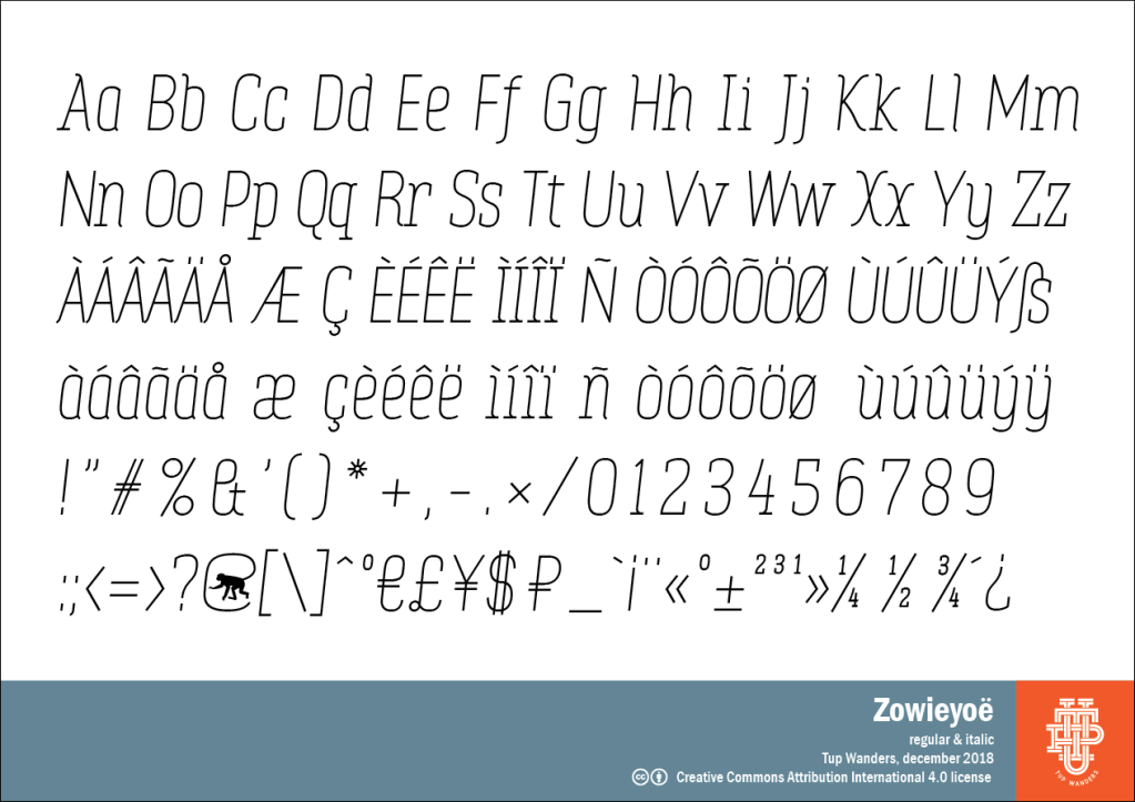
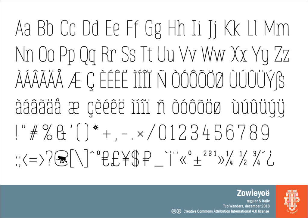
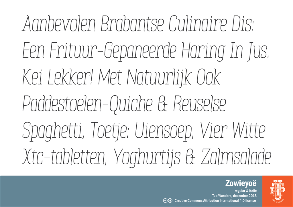
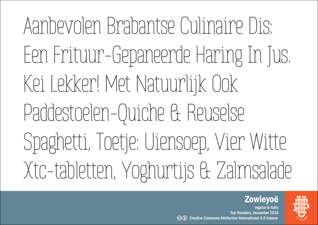
Zowieyoë
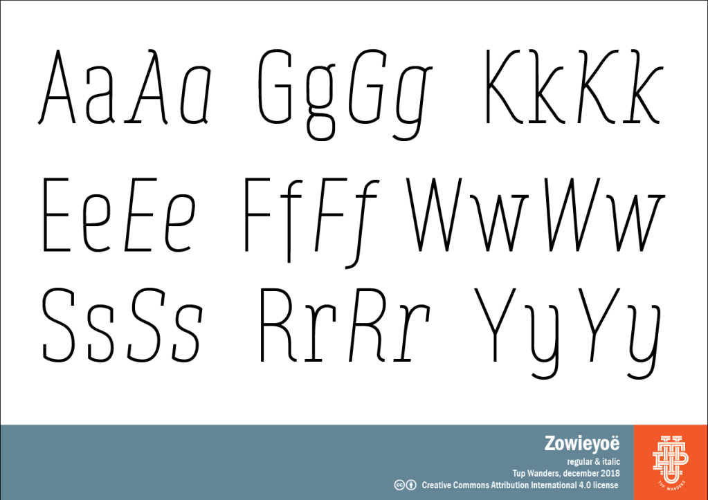
Again, I needed a thin, elegant font. My Aaargh font looked old fashioned, so I made a new one. The fatter I get, the more I love thin fonts.
This font is something between a serif and sans. In the end I think I came up with a pretty consistent design. It’s named after my wonderful, creative, smart, awesome, hilarious and super intelligent daughter Zoë who was studying graphic design at the time. By now she has transferred to studying Comic design at Artez now, the same school of fine arts that my parents, my sister and I attended. How’s that for tradition?
Available for free at Fontspace and Dafont.

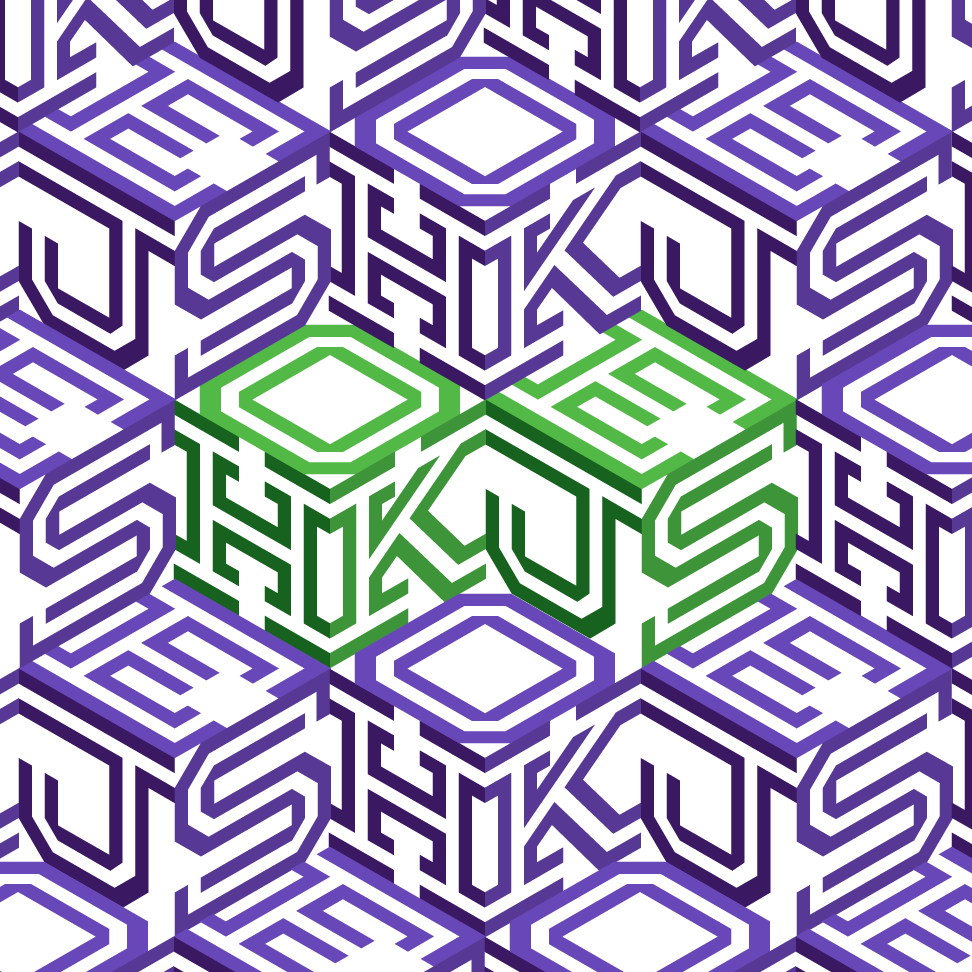
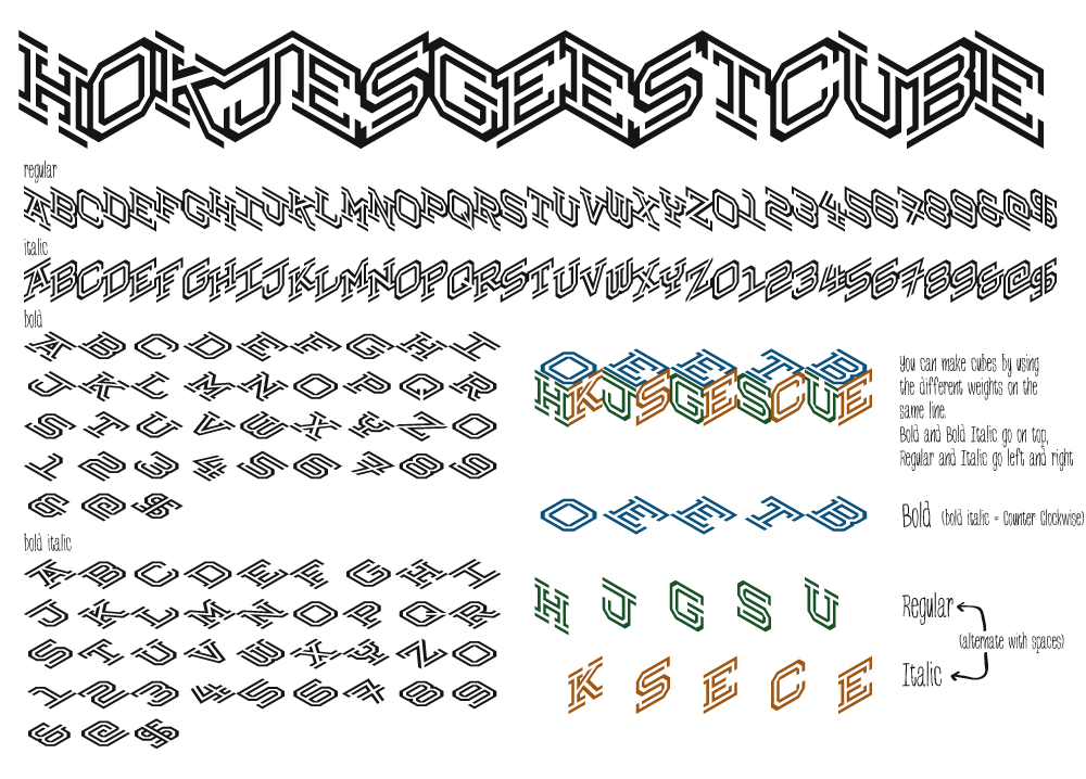
Hokjesgeest
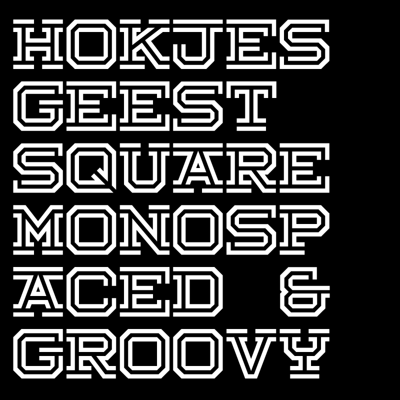
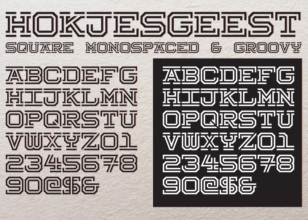
This one was part of a logo I was making (but never finished) I wanted an isometric square font so I could make cubes out of it and stack them. That doesn’t really work because there’s always three visible sides; very confusing. But it looks kind of cool, right?
Hokjesgeest font turned out to be a pretty good mono spaced font. The ‘cube’ versions still work though, even though they’re confusing.
Available for free at Fontspace and Dafont.
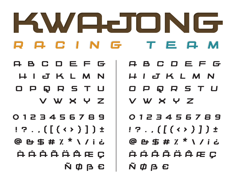
Kwajong
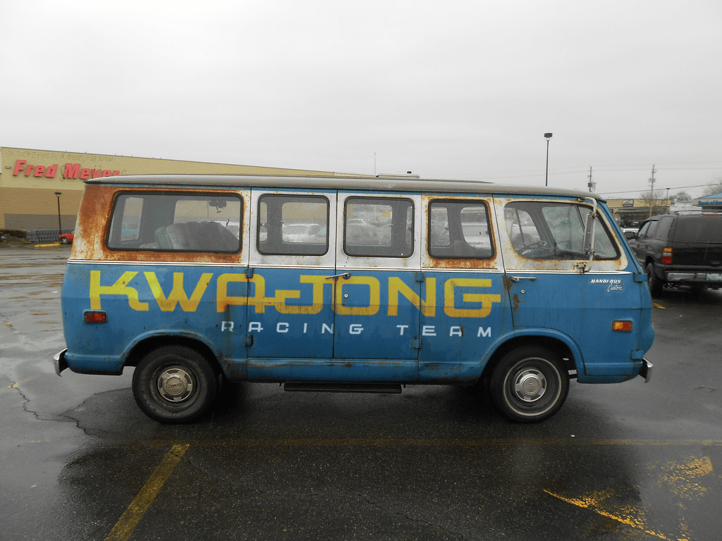
This one started out as a sort of racing font but it turned out a bit awkward. In a good way though. I like it.
Available for free at Fontspace and Dafont.
Alpenkreuzer
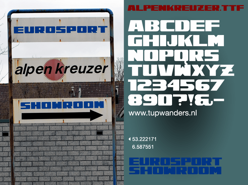
I came across a sign at the Damsterdiep in Groningen made by a business selling and repairing caravans. It had a font they obviously constructed themselves. It struck me that this kind of typography would probably come to an end because everyone has access to simple design tools online. So to preserve at least this one gem, I made an entire display font from what I saw. It may not be pretty, but it’s very real. I love typography like this.
Available for free at Fontspace and Dafont.
Brewsky
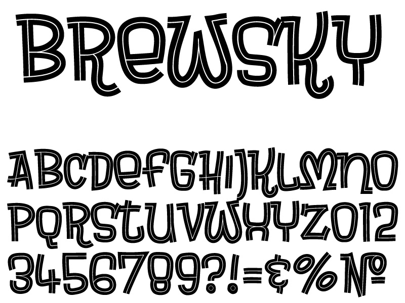
The stupidest name I ever came up with. But I really like the sixties kind of punk/underground music and the groovy typography it comes with. It’s a small, extremely simple inline display font, but it does what it has to do I guess.
Available for free at Fontspace, as well as DaFont.
Milkmoustachio
A font I made just to see if I could make one that’s connected, and to let my inner 6 year old girl out, which was pretty hard for an overweight 60+ punk rocker. Took me a while to get it right, and I didn’t quite get there, but it’s a fun stupid little cutesy font and if you can find a use for it, good for you.
Available for free at Fontspace, as well as DaFont
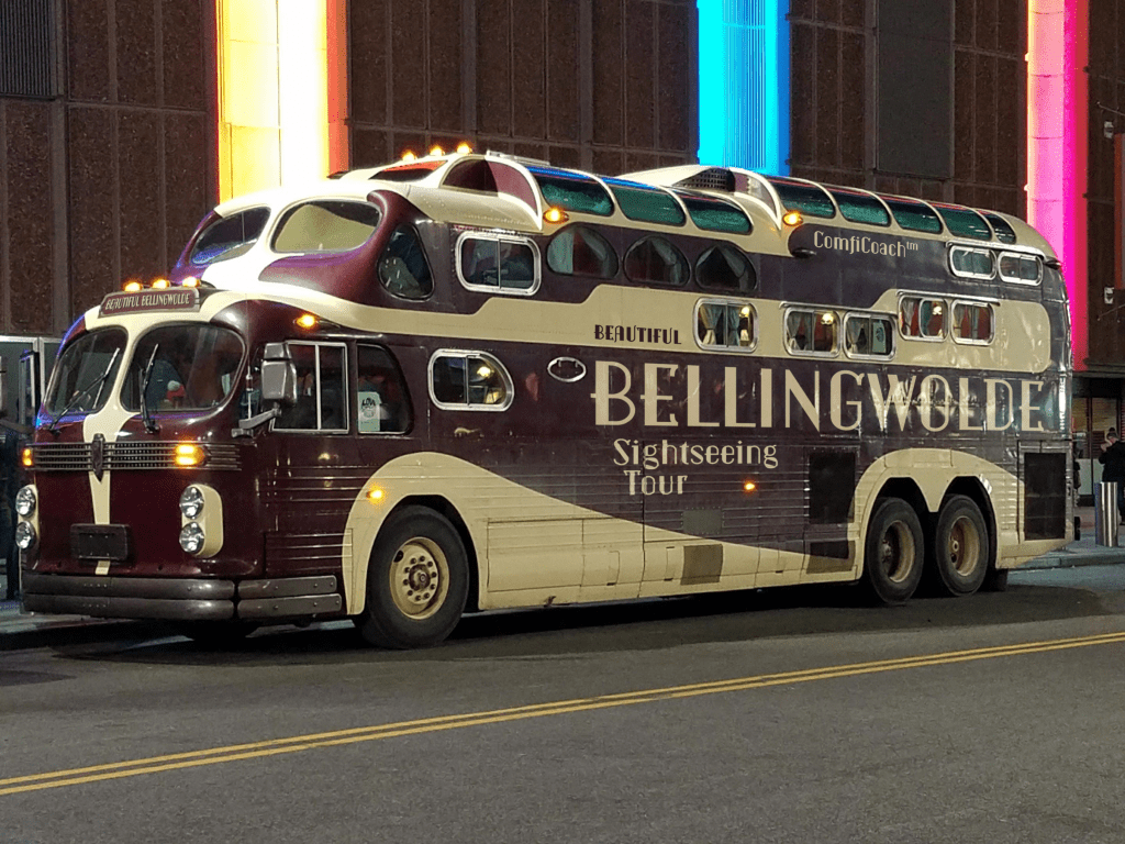
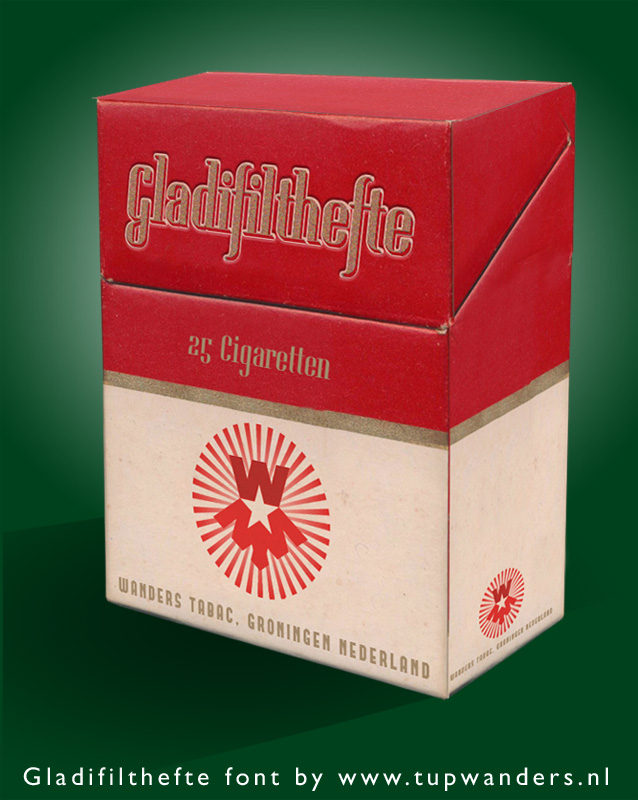
Gladifilthefte
My dad smoked Gladstone cigarettes when it was still healthy and very sportsmanlike in the sixties and seventies. I loved the smell, I loved the package it came in with the tall italic font and the plastic wrapper that had a golden strip to peel it off. The silver cover you needed to pull out before you got to the actual cigarettes, and again, the smell. Smoking was one of the coolest things my dad ever did, and one of the few things I copied. It took me forty years and a heart attack to quit smoking, but hey; the package designs were awesome. I tried to make a font similar to the Gladstone logo as I remembered it. Turns out their logo is even taller, but I kind of like the style of the display font I came up with, and it’s been used used quite often:
Available for free at Fontspace, as well as DaFont
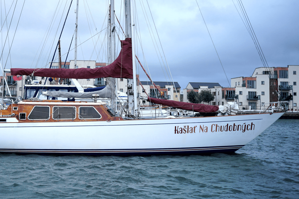
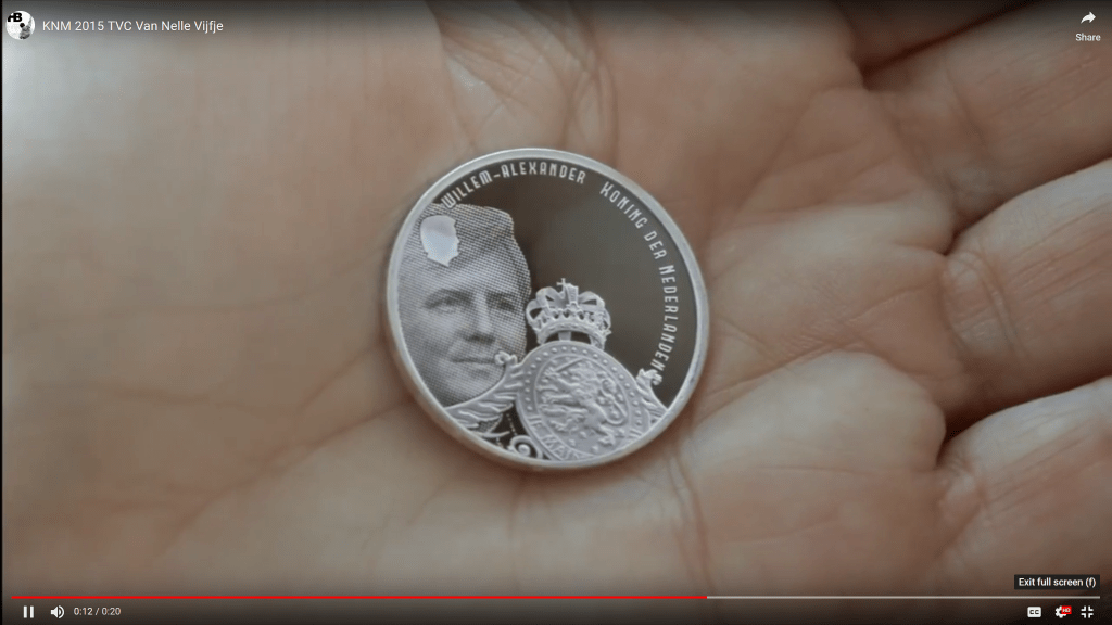
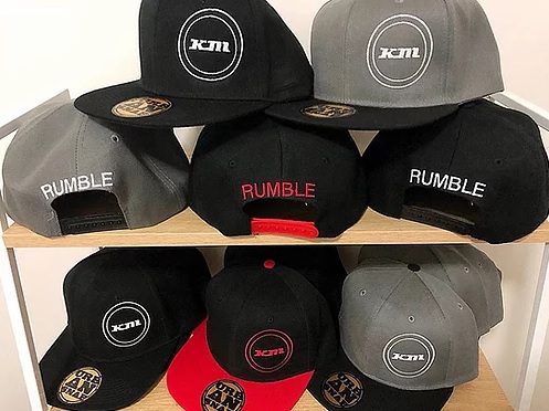
Forque
Although it’s a very limited display font with only capitals, Forque is one of my most downloaded fonts. It has a bit of a 1930’s feel with its rounded A’s M’s and W’s, and that style became popular about ten years after I made it. I see it used all over the place; it’s even on a commemorative 5 euro coin.
Available for free at Fontspace, as well as DaFont

Aaargh
A slightly anorexic font I made at the start of the naughties. I needed a really thin font for package designs, something like the thin Avant Garde. But I thought the shapes used in Avant Garde were too geometrical, too old fashioned, too anal retentive. So I made this one. I kinda like it but the line thickness is a tiny bit irregular. I drew it from scratch where I should have single lines with a stroke.
Available for free at Fontspace, as well as DaFont
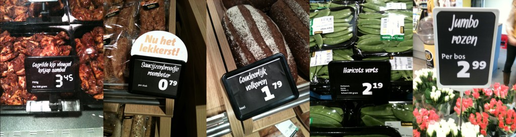
Snickles
And yet another one done in a single night. It’s very irregular and inconsistent, but it has been used a lot. Looks like the kind of font a shopkeeper would make with a marker to sell smelly fish and stale bread. Maybe that’s why the Jumbo supermarkets use it.
Available for free at FontSpace and DaFont
Effortless
Another one from the late nineties. I tried to make a seventies font, one that would have been used for play doh packaging or for a cheap cafetaria or diner. It didn’t turn out too well, but hey who cares?
Available for free at FontSpace and DaFont
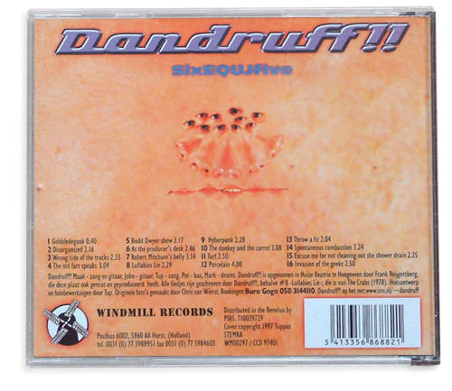
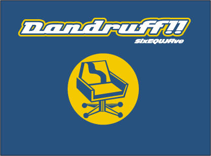
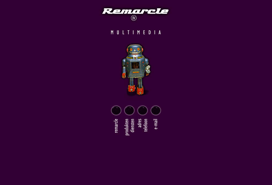
Remarcle
In the late nineties I started a business with my friend Markus, we made websites, cd-roms and software. We wanted a 50’s logo which I made, and later I added more characters to make an entire font. It doesn’t have any numbers though. I also used it as a logo for my band Dandruff!!
Available for free at FontSpace and DaFont
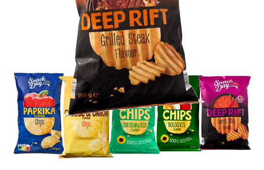
Greenbeans
Just like BLOK and GOBBLEDEGOOK, this one was made in about 30 minutes in the early nineties at Vera. It’s just handwriting with a single width stroke. Very sloppy and slap dash design. The other day I noticed that they use this 30 year old monstrosity on Lidl’s chips (crisps) bags.
Available for free at FontSpace and DaFont
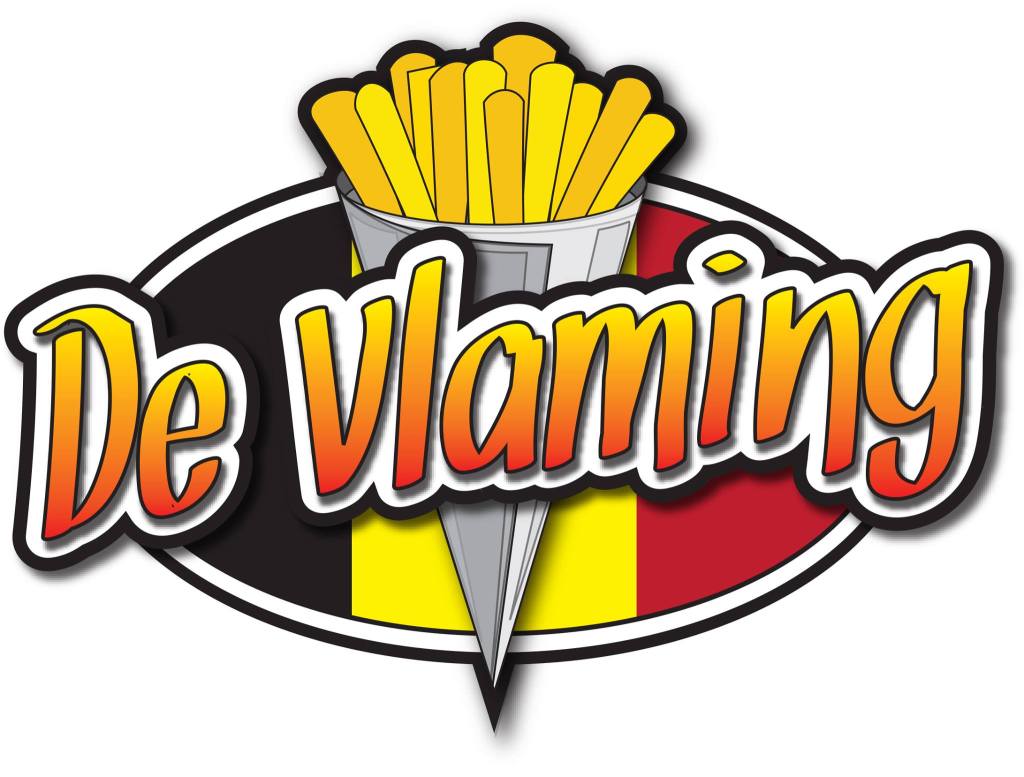
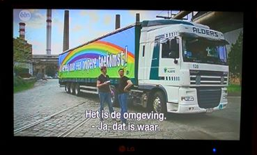
Gobbledegook
Just like BLOK, this one was made in about 30 minutes in the early nineties at Vera. It’s just ’80’s style handwriting with a single width stroke. The picture below is from a Belgian TV show where they went to Hungary to buy clean air. Ha!
Available at FontSpace and as always free.
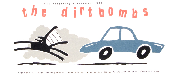
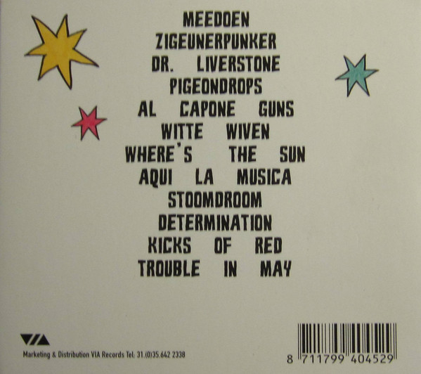
Blok
When I worked as a volunteer poster designer/printer at Vera Groningen during the eighties and nineties. I was experimenting with full color silkscreen prints for which I made color separations using a full-color copier: printing each cmyk color in black on separate transparent sheets. It kind of worked, but not very well. By then personal computers started to get better quickly and I got Vera to buy its first one for the print shop, so we could design posters on it (and print better color separations).
It came with a version of Corel Draw, that allowed you to make your own .ttf fonts. Blok was the first one I made, in about 30 minutes, just to see if it worked. It did, and this ugly font even got used every now and then. You can tell I didn’t know how to adjust the word spacing 🙂
Available for free at DaFont and FontSpace

I believe all these designs are by Willem Kolvoort, except the Prong one, I suspect that’s by Ricky van Duuren.
